Thursday, September 26, 2013

Avoiding Mergers

The picture shows two guys being cut out like the guy in the bicycle and they guy by the red post. always avoid mergers.

Framing

the spoke thats emitting from the building and going up, that frames the picture by the spoke that is covering the top.

Balance

While looking at this picture you can see how their arms and the way that they positioned their body make a shape and it shows the way it balances out.

Lines

The lines from the building are going up and leading our view to the plane that is going towards the building and the smoke.

Rules of Thirds

the guy is more towards the side rather than the center and his shadow is also by the side where we can see it and it makes a good picture to present as rules of thirds.

Simplicity

in the picture while the building is in plain sight the background is clear making it easer for the viewer to not get mixed up and just focus on the main part.

Tuesday, September 24, 2013

Elements of art and principles of design

\
Line 

Line  Line    Line  
Line- Lines are marks made by a pointed tool: brush, pencil, pen, etc. Lines can vary in width, direction, curvature, length, or color.

i chose this painting because of the way the lines are strong and they create a person showing some kind of betrayal.
I chose this photo because of how the lines are everywhere and the kind of look like they are spiral.


shape- Shapes are formed wherever the ends of a continuous line meet. Geometric shapes such as circles, triangles or squares have perfect, uniform measurements and don't often appear in nature. Organic shapes are associated with things from the natural world, like plants and animals.

I chose this painting because of how the shaped rectangles are shown in the pictures and how they stand out.


I chose this picture because i see how the circles are shown in a row and the shape gives the picture a different feel.


Color- Color wheels show the primary colors, secondary colors, and the tertiary (intermediate) colors. They also show the relationships between complementary colors across from each other, such as blue and orange; and analogous (similar or related) colors next to each other such as yellow, green, and blue. Black and white may be thought of as colors but, in fact, they are not. White light is the presence of all color; black is the absence of reflected light and therefore the absence of color.
I chose this painting because of the way the colors go and blend together and they make the picture unique.

i chose this picture because of how in one side the colors are soft and in the other they are stronger.


Value (Tone)-Value, or tone, refers to dark and light; the value scale refers to black and white with all gradations of gray in between.  Value contrasts help us to see and understand a two-dimensional work of art.
   i chose this painting because the way the way the tone goes from darker to lighter in some parts.

                          I chose this picture because of how it goes from lighter to a stronger color.


Form- Form describes objects that are three-dimensional, having length, width, and height.
                   I chose this because of how the form of the ball is shown in the painting.

             I chose this picture because of how the form of the eye and eyelid are standing out.


Texture- Texture can be rough, bumpy, slick, scratchy, smooth, silky, soft, prickly--the list is endless.  Texture refers to the surface quality, both simulated and actual, of artwork.
       I chose this painting because of how the texture in the painting is shown and it shows detail.
                              I chose this picture because of all the details and texture it shows.

Space-Space refers to distances or areas around, between, or within components of a piece. Space can be positive (white or light) or  negative (black or dark), open or closed,shallow or deep, and two-dimensional or three-dimensional. 
I chose this painting because it shows how there so much distance thats emitting from the painting and it looks very open.
I chose this picture because of the dark color it gives off and it loos very opens with space.


Balance-is the comfortable or pleasing arrangement of things in art.  There are three different types of balance: symmetrical, asymmetrical, and radial. The human figure is symmetrically balanced; the same on the left and right side. The tree is asymmetrically balanced; its branches are not distributed equally on each side, but their total weight is balanced left and right. The sun is an example of radial balance; all its rays are equal in length from the center.

           I chose this painting because in both side it shoes people talking and joking around and it balances out.
   I chose this picture because of how the reflection shows in the water and it shows the exact same thing. 


Contrast-is created by using elements that conflict with one another. Often, contrast is created using complementary colors or extremely light and dark values. Contrast creates interest in a piece and often draws the eye to certain areas. It is used to make a painting look interesting.

I chose this painting because of who the light colors contrast with the dark strong colors making the painting stand out.
this picture is showing all different kinds of colors contrasting with each other, some are darker than the other colors.


Emphasis-in the focal area of an artwork gives it importance.  An artist may stress some elements of the design over others. The eye of the viewer will focus on the area of emphasis or center of interest first, then take in the rest of the composition.
 the painting emphasis the water and the broken land so the views can see whats happening and the it focuses on the people that are on the art.
The picture emphasis  on the big bright orange tree that look alive and well then it focuses on the rest of the dull trees that surround it.


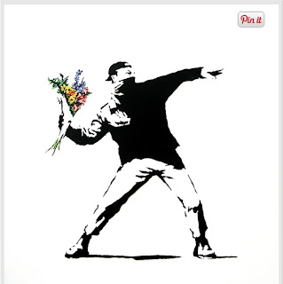
Movement-in an artwork means the artist is taking viewers on a trip through the work by means of lines, edges, shapes, and colors often leading to the focal area.  Movement is a visual flow through the composition. It can be the suggestion of motion in a design as you move from object to object by way of placement and position.  Directional movement can be created with a value pattern. It is with the placement of dark and light areas that you can move your attention through the format.


   the painting shows the shapes and different color that it creates and it flows in background with the blue.


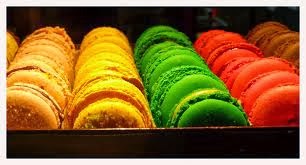
Pattern- are made in art when the same shapes or elements are repeated again and again.  Pattern uses the elements of art in planned or random repetitions to enhance surfaces of paintings or sculptures.  


           The painting shows the squares that create a pattern that goes from black and white. 


In the picture the pattern show the shapes going straight up while the others lay down and it continues doing the same thing.


Rhythm-is the repetition of shapes, lines, and forms.  Rhythm is a movement in which some elements recurs regularly.  Like a dance, it will have a flow of objects that will seem to be like the beat of music.


   The painting shows how the shapes and the forms repeat and create a cycle that repeats again and again. it has a rhythm.

                    the pictures shows the colors creating a rhythm and it also shows the shapes of circles.


Unity-means that all elements in an artwork are in harmony.  Unity brings together a composition with similar units.  For example, if your composition was using wavy lines and organic shapes you would stay with those types of lines and not put in even one geometric shape.
     i chose this painting because  shows how the elements don't change and it keeps it constant.


     I chose this picture because of how the shape stays constant and it doesn't change and it has unity.

Friday, September 20, 2013

Photo manipulations and Ethics


 Summery-

Photograph manipulation happens a lot i the middle east because a lot of people photoshop their pictures to make them better for the public to see. April fools day in israel means portrait day for the new cabinet and after they take the photo and photoshop to make it more presentable to the public eye. Photo manipulation happens all over the world with different people and photoshop has become a conflict for some people or countries. Photoshop makes the picture look different sometimes they cut off someones legs just because they don't look good or they take a women off of a picture because she doesn't belong there. Sometimes the people that take the photo and manipulated get fired because of what they did.


I think photoshop is very wrong if your using it for bad things, because sometimes it hurts people and the people feel like they have been lied too and that they are not worthy of the truth. Also it makes the person being manipulated in the picture feel bad about themselves sometimes or they get angry and that causes problems. I don't think photoshop is that bad if you aren't hurting anyone or doing something that will effect you or others.


I think this picture is the worst because they made it look like the solider was being the bad guy and that   
he was telling the guy with a kid to stop or something. they just made him look really bad to others and the original pictures showed him being a good solider and this just made him look bad.

I don't think this photoshop is that bad because they are not changing someones appearance and they aren't really making anything awful and they just moved the mountains so it really wasn't anything that bad and maybe it was better to photoshop in this situation to make it better for students.

Wednesday, September 18, 2013

Great black and white photography part 2

Margaret Bourke-White was born in June 14,1904 she was born in bronx New York and was raised in Bound Brook New Jersey.She had started loving photography at a young age and wanted to peruse it, she graduated from Plainfield high school and she then started with her herpetology studies even tho she loved photography at colombia university.Her love for photography strengthened after her studies with clarence white. She took a brake for a semester that followed her fathers death. when she decided to continue her studies she transferred a lot of collages and she ended up graduating at cornell university. one year later she moved from her home to cleveland ohio and opened her own commercial studio. Her success was due to her skills with both people and her technique. She then accepted a job as an associate editor. in 1953 she developed parkisons desease she was forced to slow down on her work and get many treatment for her sickness . Bourke died in 1971 in Stamford hospital at age 67.

post shoot reflection

http://angelmartinezphotojournalismblog.blogspot.com/
I like all the photos they took and the metal picture is good because its really cool how they angled the camera and took a picture of all the lookers and how the lighting makes all the colors stand out a little more. one thing they can improve is to make sure pictures don't come out blurry like the red photo.

National geographic contest

I like this photo because i love the way the colors of the bird stand out and the background is a darker color so it makes the colors brighter. i also like how the setting is and how its just standing on the branch all peaceful and it makes the whole picture pretty the way the colors and the settings go together.

Monday, September 16, 2013

40 greatest photos ever

i like how true and real this picture looks. it shows the emotion that he is feeling for the loss of his father. i also like how the man is showing him that the flag now belongs to him and the little boy is trying to act strong.The lighting is very good and it reflects perfect against his skin.


the women in the picture is trying to give good luck to the soldier by putting a flower on his gun.I like how it has meaning and it represents something, also the picture was taken in a good angle in show what she is trying to do and the line of soldiers that you can see makes the picture better and more meaningful.

the surprised look on the boys face gives the picture a different kind of look and its unique in a way.i love how the light shines of his hair and then theirs like a headphone stuck in his ear which tells the viewer that he was probably listening to music and he could've been caught of guard and that makes the picture unique and i like that about it.

RED,METAL,HAPPY (happy)


RED,METAL,HAPPY(metal)


RED,METAL,HAPPY(red)


Tuesday, September 10, 2013

Camera Parts


Aperture-It is like a pupil, before light reaches the film it must first pass threw the aperture

Shutter-Blocks all light from exposing the film until you press the button 

Exposure- is the measure and balancing of life 

F-stop-controls light, it does it by closing up the restrict light, and opening up to let it through

depth of field-is the nearest and farthest objects that appear in a sharp image

focal length- the number on the lens


Live view shooting button-gives idea what the picture would be like
Aperture button-it controls light 
Erase button-it deletes a picture that didn't came out good
Movie shooting button-it makes a video instead of a picture
Menu button-its the button that takes you home to the main screen
Setting button-where all the things you need are like help or where things are
Display button-it brings up your pictures and you can see them 
Reduce button-it make your picture smaller
Magnify button-makes everything more clearly and makes things look closer
Playback button-the button that reverses every image that you want to see again

Camera History


1.camera obscura is also know for being "dark room" the whole acted as a lens focusing and projecting light onto the wall of chamber.

2.When isaac newton and christian huyens perfected the understanding  of optics and the process of making high quality.

3.parts were a glass lens,a dark box and film

4. light into the camera and exposes the film. and guess what? the end result is still a photograph

5. an electronic sensor  AUTO

6. camera will control flash and exposure. Most camera have it labeled "auto" and other "A"  PROGRAM

7. attempt to blur background camera will try to use the focus lens settings

8. to freeze motion, camera will use the highest shutter speed possible

9. it will tell the camera that your almost ready to take a shot and be prepared

10.  No flash

11. Fire the camera if it needs more light

12. The picture will be washed out

13. the picture will be to dark

14. represent a relative change in the brightness of light

15. 1

16. 2

17. more light

18. less light

19. control the aperture by setting the "aperture opening"

20. by opening up the aperture to let more light in

Friday, September 6, 2013

Black and White photography

  
                photography by Lee Friedlander


photography by Robert Doisneau
  photography by Margaret Bourke-White

Wednesday, September 4, 2013

First photos-best and worst


I picked the first photo because i like the way that it came out all clear and the way the that she posed for the picture.Also the lighting came out good and it didn't come out blurry.

The second picture i don't like very much because it came out very blurry.You can't really see her face out what she is exactly doing so its not the best picture. I also don't like the way that the angle of the picture is because i think it could have been in a better position.

welcome to my blog